Kroger Pay At The Pump — Case Study
Giving Users control, reducing drop-offs, and driving digital adoption
Project: Kroger Pay – Custom Amount Payment Flow
Role: UX Designer – research synthesis, interaction design, dev/PM handoff
Timeline & Team: 6 weeks with 1 PM, 2 engineers, and a design lead
Description: Added a custom payment option so users can pay partial amounts via Kroger Pay instead of the full balance.
🚩 THE PROBLEM
User Pain Point: Users couldn’t split payments between gift cards, EBT, or debit/credit, causing frustration.
Impact: Users abandoned Kroger Pay for manual checkout; adoption lagged, reducing ROI on the mobile wallet.
🧐 RESEARCH
Methods: User interviews, store associate feedback, competitive analysis (Apple Pay, Walmart Pay)
Insights:
Shoppers often budget with multiple payment types.
Users want control to pay partial amounts.
Clear split-payment breakdowns build trust.
Impact: Validated need for custom amount entry to improve adoption and control.
Quotes from Our Users:
“The moment I saw the custom entry, I knew exactly what to do.” - Cynthia (Avid Kroger Pay User)“I feel more in control of my money now.” - John (A Regular Fuel Shopper)
👨🏻🎨 OUR DESIGN PROCESS
Tested placement (before vs after QR)
Built a keypad + real-time balance
Iterations: Moved entry before QR, and simplified error handling
Collaborated with devs and PM on logic and rules
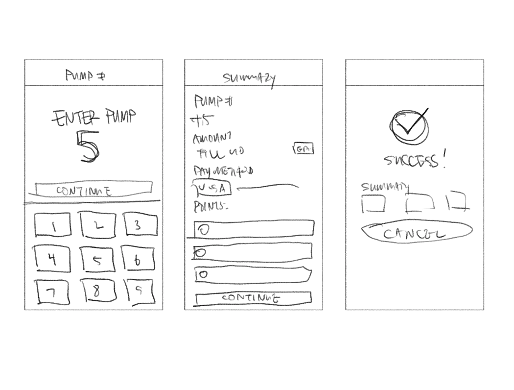
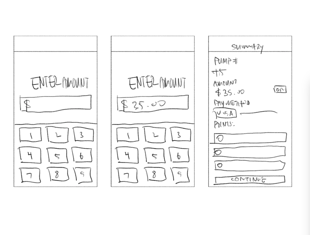
✏️ LET’S SKETCH
Sketch Shows: Shows a rough view of the happy path of the pump experience looks like.
Sketch Shows: Custom Amount experience within the Kroger Pay at the Pump Experience
✅ THE SOLUTION
Final Design:
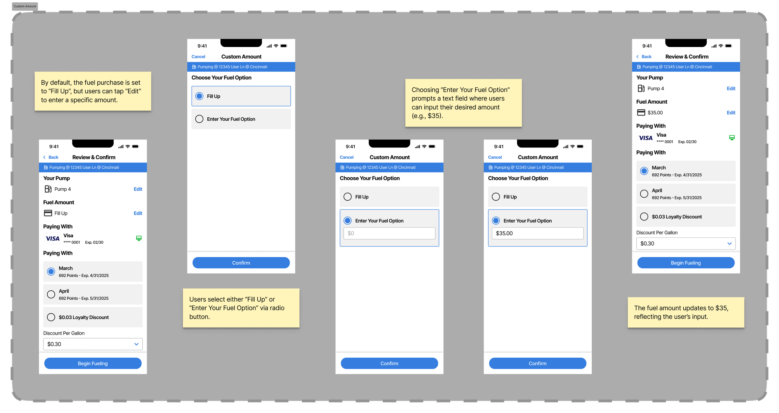
Numeric keypad to enter any payment amount.
Real-time balance summary showing applied + remaining total.
Clear error messages if funds were insufficient, with options to complete payment via another tender.
Accessibility/Content:
Large keypad and high-contrast text for legibility.
Plain-language labels (“Pay Custom Amount”) instead of jargon.
💻 FINAL DESIGN
Kroger Pay At The Pump (Entry Point)
Custom Amount Feather
⭐️ OUTCOME
+18% adoption, fewer abandoned payments
Users liked flexibility; associates noted smoother checkout
Lesson: Small friction points hurt adoption
🪞 REFLECTION
What I’d Do Differently: I’d run longer-term testing to see how user behavior changes over time.
Growth: I got better at designing for edge cases in financial flows and learned how important it is to make error states clear.


